雅思写作真题(Task 1 小作文)
英国三类移民的原因和占比
最近考试:2024.3.2
题目原文
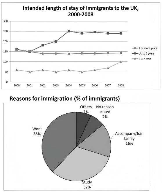
The line graph and pie charts below show the number of three groups of immigrants from 2000 to 2008 and the percentage of immigrants for different reasons in 2008. Summarize the informaiton by selecting and reporting the main features and make comparisons where relevant.