雅思写作真题(Task 1 小作文)
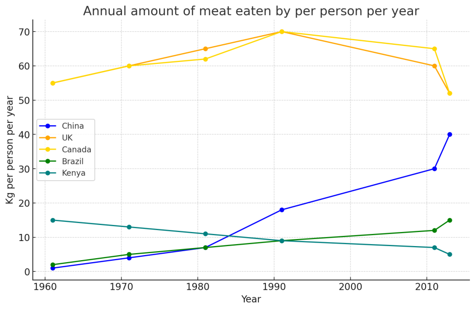
五个不同国家每人每年肉类消费量
最近考试:2025.2.22
题目原文
The graph below shows the annual amount (kg) of meat eaten per person per year in five different countries from 1961 to 2013. Summarise the information by selecting and reporting main features, and make comparisons where relevant.